---
This post begins with the job market. I'm on it this year. The requirements are slightly different for each available position in terms of what ought to be sent when, but each university to which I'm applying sooner or later (hopefully) will want a writing sample. That means 10-15 pages of poems.
For a moment, let me clarify something for those of you who aren't writers. No condescension, just making this clear: Narrowing down one's poems into a book-length collection is hard. You have more poems than can fit into a volume. You'd think that eliminating some would be easy - after all, there are poems you know aren't as good as others. But sometimes those lesser poems provide the perfect transition between two better poems. Now you're making a book that isn't just a collection of individual poems, but something that develops organically in the reader's mind. That's infinitely better than good poem -> good poem -> good poem. Chapbooks are shorter and, in a sense, easier. They're usually tightly-wound about a theme, or progress chronologically, or have some other guiding factor. They're also generally longer than ten pages.
To pick and choose ten pages of poems is to pretend that I'm not working towards some whole, a future collected works that isn't just a "greatest hits" volume but a cohesive (if slippery) worldview.
Add to this the variety of poetic styles I practice. I'm not saying I'm great in all or any of these, but I write postmodern and modern poetry. I produce visual and performance poetry. I have lyric and narrative and political and romantic verse. I'm supposed to pick 10 pages out of this to sum myself up for the committee?
I've made it into the second round of the selection process at a particular university (which will remain unnamed at this point in time), and the head of the selection committee let me send El Oceano y La Serpiente / The Ocean and The Serpent as my writing sample. This was a huge relief.
For the places yet to ask (or that I have yet to apply to) I'm debating whether or not to include, say, a DVD with "ADD TV" on it. Does a three-minute performance piece equal one page? Two pages? Three pages?
Sigh.
---
In related news, Ron Mohring over at Seven Kitchens has begun talking with me about cover images for The Icarus Sketches. I'll keep you updated when the top choice for artist gets back to us (if she gets back to us).
In the meantime, I'll take a page from Gary Sullivan and the many people who joined in last year.
Book covers I particularly like:

Alaskaphrenia by Christine Hume
Christine is a former professor of mine (and a damn good one). I also quite like her work and own three of her collections - Musca Domestica, Alaskaphrenia, and Lullaby. Of the three, I think I still read her debut most often, but the design on Alaskaphrenia is top notch.

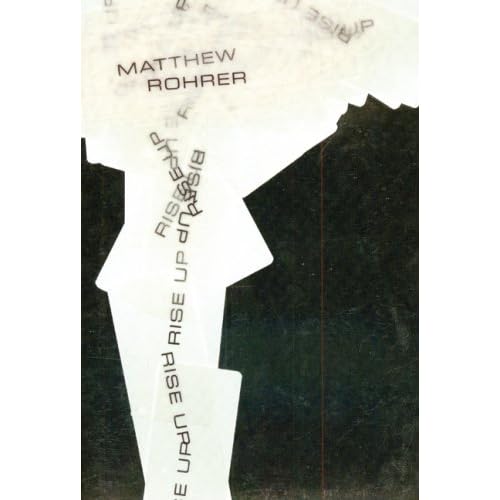
Rise Up by Matthew Rohrer
Reviewed (and also given props for its cover) at coldfront magazine.
Studying Poetry by Barry Spurr
An unconventional choice, but the covers of most how-to writing books, textbooks, suck. There's an honesty to the spiralling handwritten text that's sorely lacking in the neat, self-helpy appearance to most of these things.

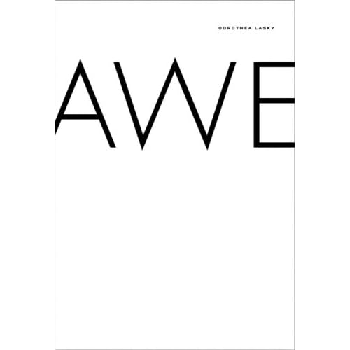
Awe by Dorothea Lasky
Seconding Clayton Banes on this one. I linked to Banes' blog above.
Bloodstains on a Battlefield by Roger Bonair-Agard
This is a standard slam poet's chapbook - run off at Kinko's or somesuch with almost no thought to design. But Bonair-Agard used crayons to draw unique sketches on every single cover. You can't beat that.
All the names thus far have been poets, not the folks who designed their books. To switch gears briefly:
Just about everything by Jeff Clark. He's good enough that some people have started to worry about him being too good. Sometimes they'll replace the word "good" with "slick" or "commercial" to cover the fact that they're worried about him being good. But really, just about everything from this guy is solid.
Anything Unicorn Press from the early 70s. For an example, check my previous post about Rexroth. Al Brilliant and his coworkers made some beautiful books. I recommend actually getting your hands on one, because their beauty is most often due to restraint and good proportions.
Ah what the heck - my first foray (and my second chapbook, under the auspices and tutelage of the aforementioned Al Brilliant). The image is by Antonio Pratsa:


No comments:
Post a Comment